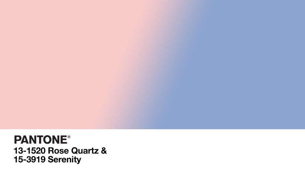
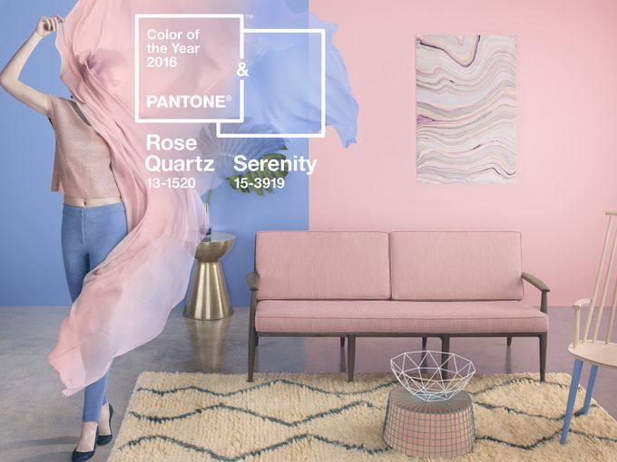
Pantone, the prominent color consultation company, recently released its decision for The Color of the Year 2016. The significant change for 2016 was due to the fact that Pantone deviated from the usual one color selection, and made a bold choice to have two colors represent 2016. These are not just any two colors, Rose Quartz is a pastel pink and Serenity, a baby blue are side by side as a powerful statement. They are meant to invoke questions about our ingrained biases, how we see the world and where are are currently in society.
In our day to day lives, we may not be aware of how much color influences our choices or our mood, but Pantone does. As a company that specializes in the understanding of color, Pantone possesses a variety of color experts that analyze colors, what colors are suggestive of, and what impressions colors have. They help brands choose the proper colors and study how effective colors can be. And in a way, Pantone proves a point. It’s practically instinctive that we associate red with boldness, blue with levelheadedness, and etc. Clear point is colors have influence.
A lot of color research and critical analysis of our society went into choosing both Rose Quartz and Serenity. On the Pantone site, it’s described that the colors “demonstrate an inherent balance between a warmer embracing rose tone and the cooler tranquil blue, reflecting connection and wellness as well as a soothing sense of order and peace.” It seems that Pantone wasn’t necessarily concerned with setting the next fashionable color trend, but rather, they were more concerned with choosing colors that would influence people well. They described Rose Quartz as “a persuasive yet gentle tone that conveys compassion and a sense of composure” while Serenity “is weightless and airy, like the expanse of the blue sky above us, bringing feelings of respite and relaxation even in turbulent times.”

Photo courtesy of Pantone
Pantone applied purpose to their selection by challenging common assumptions while being uniquely aware of social progress and the fluidity of gender. We generally equate femininity with pink and masculinity with blue, by allowing these colors to sit side by side, Pantone was making a statement of awareness and unity. The Pantone website states, ” [t]his more unilateral approach to color is coinciding with societal movements toward gender equality and fluidity, the consumer’s increased comfort with using color as a form of expression, a generation that has less concern about being typecast or judged and an open exchange of digital information that has opened our eyes to different approaches to color usage.” Additionally, with the combination of two unlikely but soothing colors, Pantone is encouraging a new attitude and mindset for the next year. In response to the conflict, uncertainty, and stress that is currently rampant around the world, the harmony of two beautiful colors is a wonderfully calming idea. We fully support pink and blue in 2016.

